
All success online businesses know how to create high-converting landing pages. In a world driven by online services and e-commerce, the market is saturated with brands clamouring for customers. You want to make the buying experience seamless and smooth so that your business provides a measure of relief from all that noise. By giving the customer what they want, with minimal fuss and maximum payoff, you’re sure to see great results.
Your e-commerce landing pages are one of the most crucial steps in ensuring the highest possible conversion rate. But how does one go about building one? We’ll walk you through our top tips – but first, what exactly is an e-commerce landing page?
What is an E-commerce Landing Page?
An e-commerce landing page is a targeted page created to drive sales of an online product or service. They are created specifically to match the intent of user searches, in order to show the customer the product they’re looking for. They often appear after a person clicks on an advertisement, such as a pop-up or banner ad on a different website, or as a search engine result.
While many e-commerce landing pages take the form of a regular web page, there are other options – such as a marketing video for the intended audience and demographic.
Once the potential customer is taken to the landing page, they can see how to purchase whatever item they clicked on, and the benefits of doing so. It may also include shipping guidelines – especially important if you ship from the UK to the US, or offer other international shipping options.
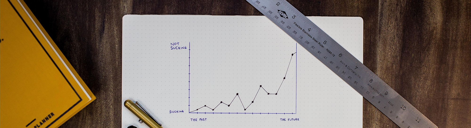
Having good e-commerce landing pages is an essential first step to the conversion funnel; the practice of gently moving customers towards buying a product or service. It’s not enough for them to be simply aware of what you’re offering, you have to make them want to buy it. Make them an offer they can’t refuse!
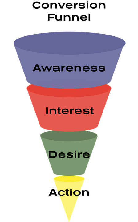
Image Source: Pixabay
Why are Conversions So Important Anyway?
We’re sure you’ve already figured this one out – you’re clever enough to be reading this article, after all. But in case it’s still not clear: conversions are the goal of your e-commerce service.
While having a great landing page isn’t the only thing you need to think about to boost your profits – there’s a whole host of things to consider, like designing a great product, knowing how to calculate gross profit margin, and accurately targeting your ideal audience – it’s certainly important.
E-commerce landing pages are no use if people just view your product, think, “huh, that’s cool, but maybe later”, and move on. You have to convince them that purchasing your item will solve a problem they’ve been having, make their life easier, and improve their general existence. You know, no big deal.
How to create high-converting landing pages
Sure, you could just post a photo of your product, add the title, and call it done. But that wouldn’t unlock the full potential these pages have. Instead…
Make your page intuitive
This is probably the most obvious thing to think about, but you’d be surprised how many people gloss over this important detail in favour of making their e-commerce landing page as bright and punchy as possible. Bright and punchy isn’t necessarily a bad thing, but when you focus too much on your colour palette and forget to put a ‘Buy Now’ button, that can lead to problems.
Remember, your potential customer has clicked on this ad because they’re already interested in buying your product. So make it easy for them! Include all the important information they need – like price, VAT, and estimated delivery dates.
Understand your audience
But how? That’s easy: research!
Making your page as intuitive as possible is all about knowing your target audience and catering to them as well as you can. Market research is absolutely pivotal here.
Think about who your product is aimed at. Is it the under-30s bracket? Consider adding a student discount for customers who make a conversion through your page. Is it the elderly population? Think about the lower rate of computer literacy amongst the old folk, and consider adding an instant messaging feature to help get them where they need to go.
Making decisions like these can be the difference between a sale or a failure for your platform, so have an online group meeting with your team and make sure you get it right.
Keep track of your analytics
This step is absolutely crucial. It might seem boring or unnecessary if you’re a small start-up or more interested in the exciting rush of a sale, but hear us out. Keeping an eye on what’s working and what isn’t can be the difference between a conversion or just simple online traffic.
Which demographics are liking your landing page? Who are you trying to appeal to? It’s a process of trial and error: change a few small things, maybe draft something new, and see how your customers respond. You can even use A/B testing (otherwise known as split testing) to trial two different versions, see which does better, and then learn how to create high-converting landing pages.
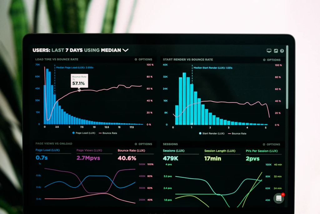
There are many companies that provide analysis as part of their package, as well as others that provide more comprehensive enterprise SEO services. What’s important here is that you choose a method of analysis that works for you and your business. Will you need to hire an agency to perform more complex analytical manoeuvres? Or will it be enough to build your own reports from your own data storage in the cloud? That’s something you’ll have to decide for yourself.
Focus on good design
It’s incredibly important to make sure that your landing page is set out in a way that makes it easy for your customers to figure out how to use it. Think about the colours you’re going to use – is a monochromatic look the way to go? Or are you aiming for a more bright and busy vibe? Consider what your brand is all about, and adjust your colours accordingly.
Take this landing page from Infinite Moon, for example:
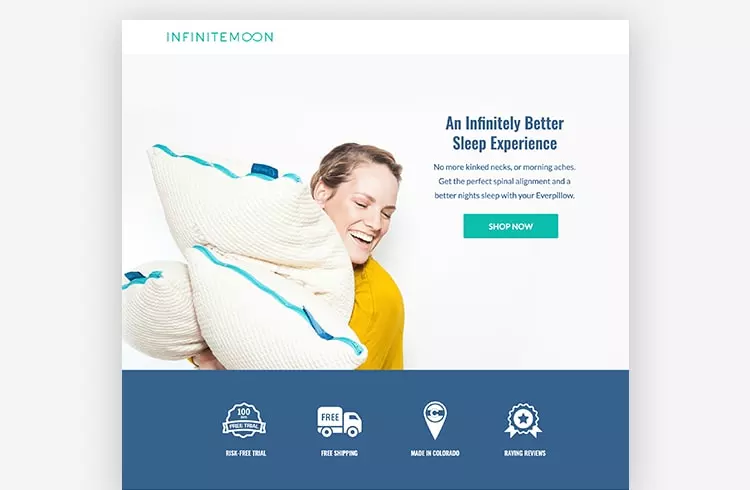
Image Source: Unbounce
This is a great example of a well-designed landing page, and here’s why!
- Blue is associated with better sleep and relaxation, so it’s a great choice for a brand that’s all about rest. The colour is also picked out in a few different hues all over the page, such as the blue seams in the pillows and the turquoise title and shop button. This brings the whole page together and makes it easy on the eyes.
- The text is nice and bold, but not overwhelming. This also ties in with the brand’s message of relaxation, but also means that the customers might actually be more likely to click: a friendly, agreeable-looking font can do wonders for your page.
- The features listed at the bottom of the page state, in simple terms, what the brand offers and the benefits a potential customer can expect. This makes the page informative, but not cluttered. The ‘Shop Now’ button remains the focal point of the page.
If graphic design isn’t your strong suit, it might be worth hiring a professional to help you optimise your page’s design. There are plenty of developer collabouration tools out there to help you with this.
Pay attention to brand identity
This may sound similar to the design elements of a landing page, but there are a couple of key differences here.
Firstly, brand identity encompasses all parts of your business. It’s not just about design, it’s about the analytics, the research, the sales, and of course the product itself. You must collabourate with your team – after all, we’ve all become far too used to online video chatting over the last year or so! – and make sure that every sector of your business is consistent.
You don’t want your social media accounts to look and sound completely different to your website – and you definitely don’t want inconsistent customer service. By paying attention to brand identity, you can ensure your customers recognise you – and are met with the same great experience every time.
Some Quick Words of Warning for your E-commerce Landing Page…
Don’t overcrowd your e-commerce landing page
It’s easy to pack way too much into your landing page. It’s completely understandable; after all, you’ve only got one shot to convert your customer from a potential buyer to a confirmed purchase. However, people are bombarded with ads screaming at them every day. It’s worth going against the current and making your page simple, classy, informative, and practical – your customers will appreciate it and be sure to remember you.
Be careful with your content
Content protection is about keeping your brand yours. You might want to make it harder for people to save/copy information from your landing pages, preventing competitors from pinching your precious ideas and passing them off as their own.
The Final Steps for knowing how to create high converting landing pages
Well, there you have it! The best ways to build a conversion-driven e-commerce landing page.
End of the story? Not quite.

Woman with sticky notes showing how to create high-converting landing pages.
Of course, e-commerce landing pages are only a small part of what makes an e-commerce business tick. There are a whole host of other problems – designing products, optimising your e-commerce logistics strategy, maintaining great customer service, and so on – that need to be solved before you might start to see results on your e-commerce page. Thankfully, there’s an equally large number of tools and services out there to get you where you need to be.
It can be easy to start panicking when faced with all of these tasks, but the bottom line is that you have to believe in the product you’re advertising. If you do that, customers will see its potential and make those all-important conversions regardless. Good luck!
 Bio: Elea Andrea Almazora- RingCentral US
Elea is the SEO Content Optimisation manager for RingCentral, the best web meeting software and collabouration solutions on the cloud. She has more than a decade’s worth of experience in on-page optimisation, editorial production, and digital publishing. She spends her free time learning new things.


